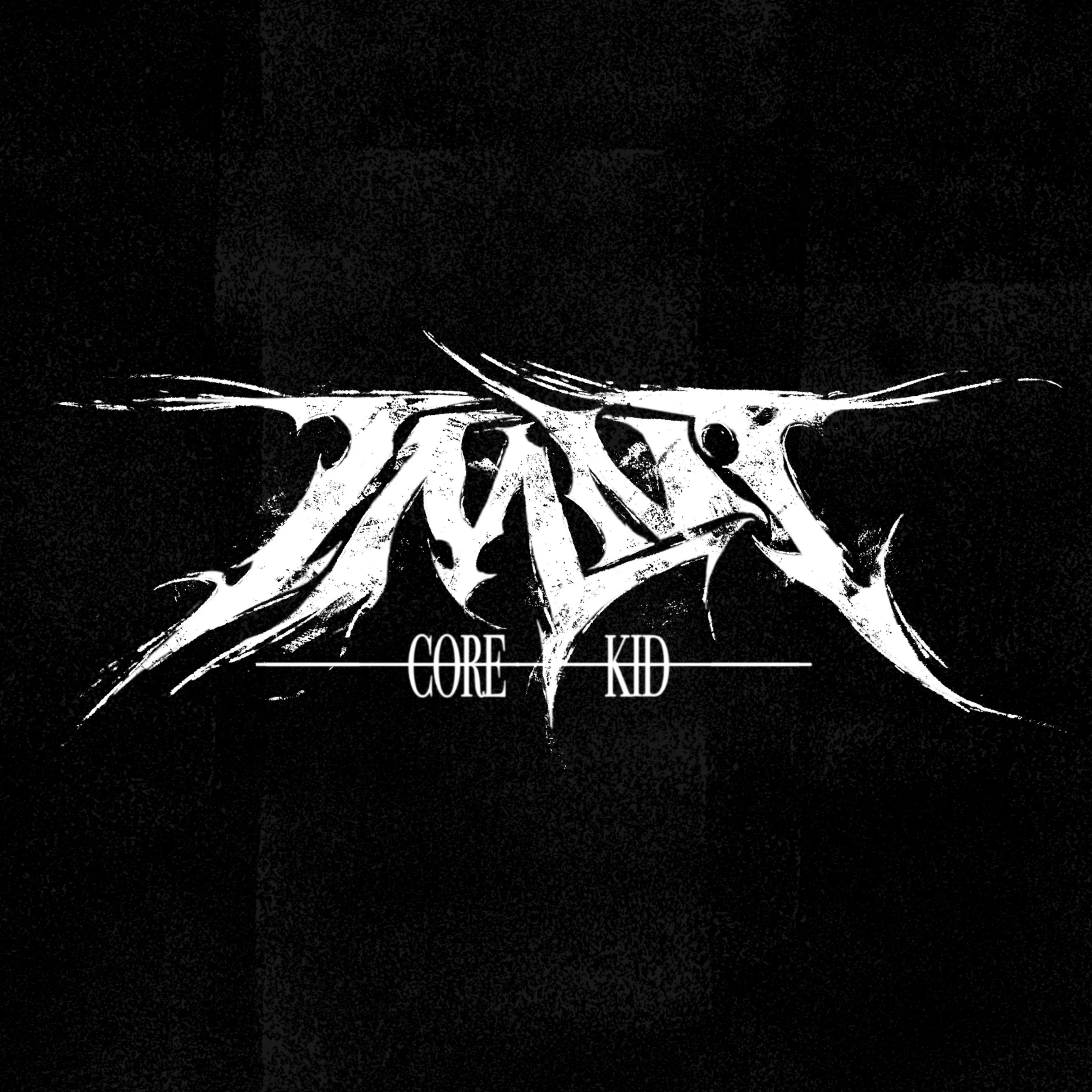
A mock logo for a Teenage Mutant Ninja Turtles comic idea I had - TMNT: CORE KID. I’ve been really enjoying playing around with text recently and being as into hardcore and metal as I am, it really fun to try my hand at design my own metal logo.
Metal fonts can cover a wide range of legibility: from fully illegible chaos to just “sharp letters”. I wanted to try to capture somewhere the middle, where you still get some of that fun distortion and expressiveness you see on like a slam band album cover while also being able to like… you know… read it.
BRAE.